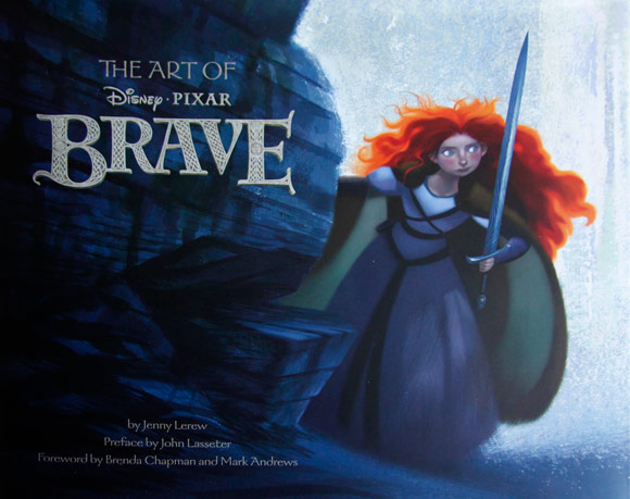
The Art of Brave — First Impressions
Amazon deliveries of The Art of Brave are beginning to arrive across the country. I received mine today and am very excited with what I'm seeing.

It confirms many of the things I'd already believed about the film based on what has been shown in the trailers, namely that this is a very environmentally beautiful film — a large majority of the art showcases the beautiful landscapes and sets designed to resemble medieval Scotland. The character designs are also very unique and full of, well, character. It is fascinating to see really how Pixar designers were able to stretch the visual variety amongst Brave characters — they are very interesting to look at. It is also striking how consistent the color palette is in this film. It sticks primarily to blues and greens, with the exception of Merida's fiery orange-red hair. Perhaps this is on purpose. As always, it is fascinating to see the various artists' different takes on the same characters.
I'm generally pretty tentative about flipping through these books too thoroughly before seeing the actual films. Normally they are quite telling and will give away much about the film. But, if you've paid any attention to the trailers, which have been quite revealing this go around, then you probably already know many of the film's secrets. My suspicion was correct in that regard. A quick glance at the larger pictures in the book will spoil few secrets. I would still discourage you from looking at the storyboard images with much scrutiny.
If you have yet to order your copy, head on over to Amazon where it can be ordered for a mere $21.74.
